Creating a SVG calligraphy handwriting animation is not too difficult if the stroke width is consistent throughout the letters. I have a tutorial about handwriting showing this technique.
When the stroke width varies, as is usually the case with calligraphy, the animation becomes a bit trickier. In this tutorial, we’ll take a look at the use of multiple masks and breaking the artwork to make a smooth calligraphy handwriting effect.
A common overlap
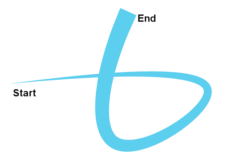
Before we look at any lettering, lets look at a simple path with a varying stroke width to illustrate what we’re up against. Take this basic example where the path starts with no stroke and gradually gets wider throughout the distance.
Mask and animate
Your first inclination may be to draw a mask over the path and reveal it by animating the length of the mask path. The problem comes in the overlap. We need a wide stroke throughout the move, but this will reveal parts too early. I’ve made the duration quite high in the following demo and added a scrubber so you can clearly see what’s happening.
See the Pen SVG Calligraphy Basic Overlap by Craig Roblewsky (@PointC) on CodePen.
You can see that the first overlap reveals sections of the path we don’t want seen yet. This is quite typical of calligraphy fonts.
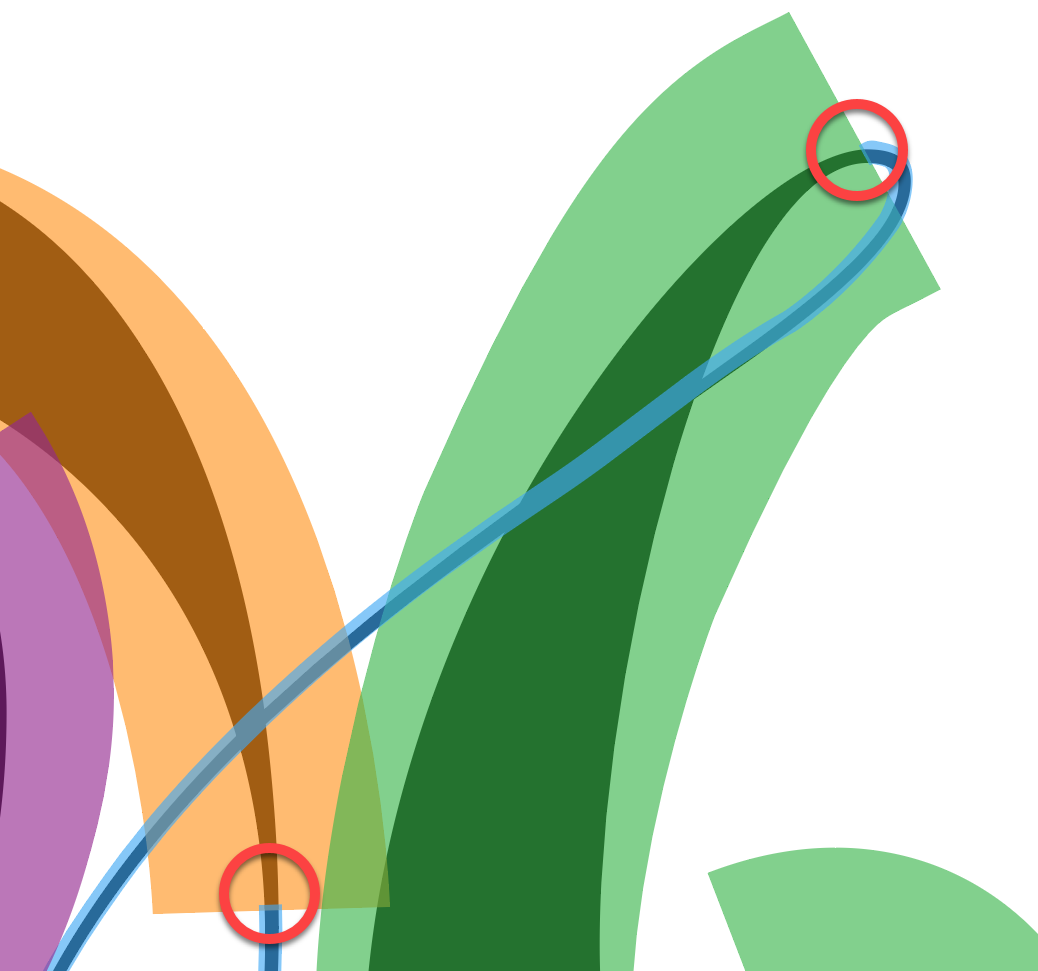
A real letter
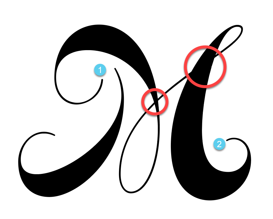
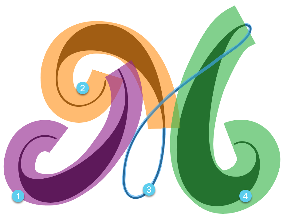
Let’s look at this capital M as a real world example. You can see it has two sections. The first section is already its own path so we’re good there. Section two starts with a thin stroke and varies quite a bit throughout the length. We will have problems with the two overlapping areas circled in red.
Make a path and animate
Just like the basic example above, creating a wide stroke for the mask will cause sections to be revealed too early. That’s not going to look good.
Break it into pieces
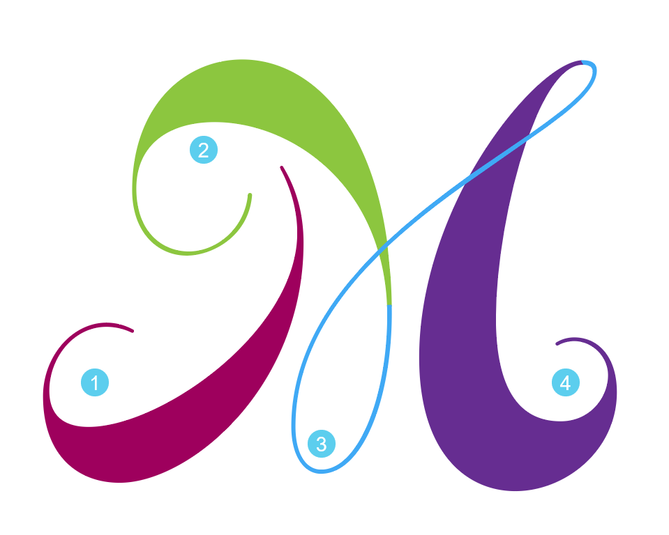
The solution is to break the artwork into pieces. In this case, I broke it into four sections.
How do you break it?
There are a variety of tools available in Adobe Illustrator. You can use the knife, the scissors, Shape Builder tool, eraser or any other way you like. In my case, I used the Pathfinder tool.
I first drew the four masks I needed. These were done with the pen tool. They are just an open path along the center of each piece. Then add a stroke just wide enough to cover the thickest part of the artwork.
Just for demonstration purposes, I’m using a variety of colors in the illustration here. Keep in mind the actual mask will need to have a white stroke to work correctly. I have a mask and clip-path article (if you need a refresher).
Next, we’ll look at the fourth piece as an example of how to use the pathfinder tool and section off the artwork.
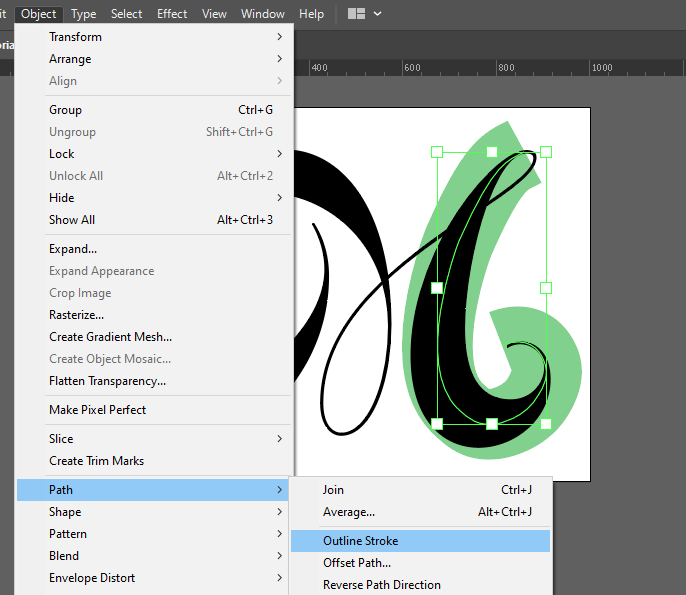
Outline the stroked path
To use the Pathfinder, you need to convert the stroked open path to a closed path. First, make a copy of your mask path because we need one for the mask and this copy will be wiped out with the Pathfinder operation. Choose the new copy and then Object → Path → Outline Stroke. You also need to convert the text to outlines (Right click and select Create Outlines).
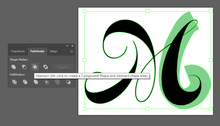
Select the two paths and click to Intersect them via the Pathfinder panel.
Leftover piece
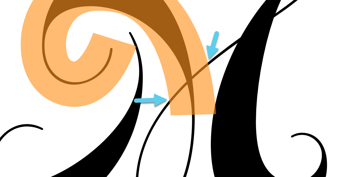
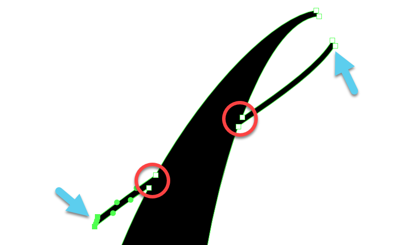
You’ll notice this left a little bit of the thin looped section because it was also under the mask shape when we intersected. It’s a quick fix though. Delete the outside points (by the arrows) and then, join the remaining edge points (red circles) to close the path.
The other pieces were created in the same way. Each one usually has some extra artwork that needs to be deleted. The thin loopy section (#3 above) needed some extra points to go over the top of section four.
I used the Pathfinder, but if you’re more comfortable with some of the other tools, go for it. It just needs to be cut apart for this effect to work properly.
Mask note
When drawing the masks (before you Intersect), you may want to overlap them by a pixel or two. This will hide tiny seams in your artwork and prevent little animation flickers.
Time for animation
Like most SVG animations, the artwork prep is the most time consuming part. It’s important to get it right as your animations will be much easier with proper artwork prep.
The SVG code was exported and I added the masks to the <defs> element. I also added a class of .strokeMask so we can more easily control all paths at once.
Next, I setup a timeline and used GreenSock’s DrawSVG plugin to set the mask paths length to 0.
gsap.registerPlugin(DrawSVGPlugin);

gsap.set(".strokeMask", { drawSVG: 0 });
let tl = gsap.timeline({
  defaults: { ease: "none" },
  repeat: -1,
  repeatDelay: 1
});
Animate the first mask
To reveal the first piece, I add the following to the timeline.
tl.to("#mask1", {
  drawSVG: true,
  ease: "sine.inOut",
  duration: 0.75
})
See the Pen SVG Calligraphy Tutorial 01 by Craig Roblewsky (@PointC) on CodePen.
Okay, cool. Now we’re starting to see something happen. Next, we animate the three masks for pieces 2-4. I used the .getLength() method to measure each path piece. (I did this manually ahead of time.)
The total length was 6,119 and the three pieces were 1892, 2225 and 2002. That represented approximately 31%, 36% and 33% of the total length. That was used to set each section as a percentage of my desired animation duration of 1.6 seconds.
let dur = 1.6;
  .to(
    "#mask2",
    {
      duration: dur * 0.31,
      drawSVG: true,
      ease: "sine.in"
    },
    "-=0.25"
  )
  .to("#mask3", {
    duration: dur * 0.36,
    drawSVG: true
  })
  .to("#mask4", {
    duration: dur * 0.33,
    drawSVG: true,
    ease: "sine"
  });
Middle section easing should be linear
The trick is to make sure the middle section has a Linear (or “none”) ease so you don’t get any weird starts and stops from pieces 2 and 4. Remember, all three need to look like one continuous stroke. You can ease into piece 2 and out of piece 4 as you like, but the middle needs to be linear.
See the Pen SVG Calligraphy Tutorial 02 by Craig Roblewsky (@PointC) on CodePen.
A little extra style
We could stop with the above animation and the lettering would look quite nice, but let’s take it a step further with a little rotation while the stroke draws.
Animate the mask path and the reveal path
To rotate an element while it’s drawing, you need to not only animate the target element, but the mask path too. Let’s look at a simple example. I’ve set the duration of the following animation quite high so you can easily see the masked element rotate as it draws.
See the Pen SVG Calligraphy Tutorial Rotate Mask 02 by Craig Roblewsky (@PointC) on CodePen.
Let’s see what happens if we only rotate the masked element and not the mask path. The target element is partially obscured as it rotates because the mask is static.
See the Pen SVG Calligraphy Tutorial Rotate Mask 01 by Craig Roblewsky (@PointC) on CodePen.
Rotate the letter sections
To apply the above rotation technique to the letter sections, I added a class of .part1 to #piece1 and #mask1. A class of .part2 was added to the other three pieces and masks. Now, we can easily rotate each section together.
tl.from(
  ".part1",
  {
    duration: 4,
    rotation: -40,
    svgOrigin: "481 252",
    ease: "elastic.out(1, 0.4)"
  },
  0.1
);
tl.from(
  ".part2",
  {
    duration: 3.5,
    rotation: -45,
    svgOrigin: "376 292",
    ease: "elastic.out(1, 0.4)"
  },
  0.5
);
I added these tweens to the end of the timeline and used the position parameter to start them at the appropriate time. Using a long duration and elastic ease shows them gently coming to a stop.
See the Pen SVG Calligraphy Tutorial 03 by Craig Roblewsky (@PointC) on CodePen.
You don’t have to add any rotation. Just drawing the calligraphy is a nice effect, but I think it adds just a little bit of liveliness to the animation.
Adding some more…
I added a little bit to the animation with another capital letter and then, staggered the lowercase paths for this final effect.
See the Pen SVG Calligraphy Tutorial Final by Craig Roblewsky (@PointC) on CodePen.
Final thoughts
I’m not gonna kid you here — prepping the calligraphy can be a time consuming process, but your clients will probably love it. I hope you picked up a few tips and techniques today for your SVG calligraphy handwriting animation. Until next time, keep your pixels movin’.


