Animating handwriting can be tricky as you usually need open paths to create the effect. In this two-part tutorial, we’ll look at creating the paths and animating it with GSAP.
In part 1, I’ll show you how to make open paths from a font in Adobe Illustrator. In part 2, I’ll show you how to animate the words and have an element follow along to simulate the drawing.
How do we create a handwriting effect?
So, you want to make this effect and maybe even have a hand, pen, paintbrush or some other icon look like it’s drawing? I’m going to explain my process for making the open paths necessary for this to work well.
Is my way the best? Who knows? I’m kind of a goofball, but it works for me and hopefully you’ll get something out of it. I’m assuming a working knowledge of Adobe Illustrator and won’t be discussing any of its usage in depth.
See the Pen Simple Handwriting GSAP 3 by Craig Roblewsky (@PointC) on CodePen.
Maybe use your own handwriting?
If you have great penmanship and a tablet, I say go ahead. Write something out and you’re ready to animate so you can skip the first few steps of recreating a font.
I’ve forgotten most of my elementary school cursive writing lessons. My penmanship looks like a combination of cursive, block print and some sort of ancient alien hieroglyphic symbols found at the Roswell crash site so that’s a no-go for me. Even if you have exquisite handwriting, you may not have a drawing tablet and it can be a bit tricky to write with a mouse. So, what do you do?
Pick a font
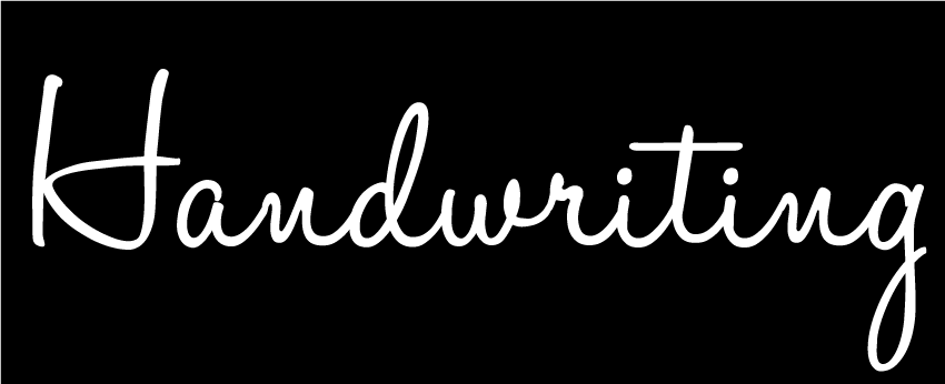
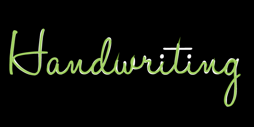
Find a cursive font you like. I’m using HaloHandletter Bold. This whole process works best if you use a font that has an even width stroke throughout the letters. If you want to use some calligraphy fonts with varying width strokes, I’d use a mask instead of the method I’m about to describe. Here’s what we’ll try to create with open paths.
You might think it’s as simple as creating outlines from the font.
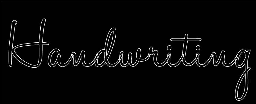
That looks kind of weird and probably not what we want. For some block letters, you may want an outside stroke to animate and fade-in the fill but for handwriting, it’s not quite right.
Use the pencil tool
Let’s lock down the text layer, create a new layer for our paths and see how we can make this work. I like light text on a dark background for this type of process, but do whatever works for you.
What we need to make this work is an open path down the middle of these letters. The pencil tool is good for that. Double-click the pencil tool and crank the fidelity smoothness up to the max.
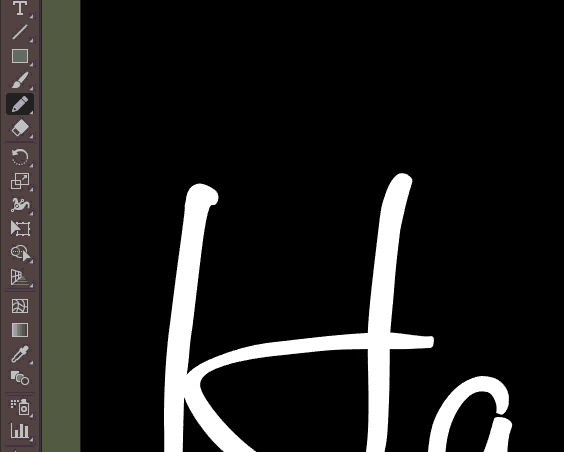
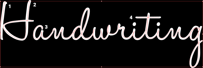
Now, all you do is trace the font as best you can. Remember to draw in the order you would for cursive writing. For this word, I have four paths. Two for the capital ‘H’, one for the main body of the word and one for the cross in the ‘t’.
Don’t worry about perfection
You don’t have to make it perfect. Just get as close to the center as you can. You also don’t need to do it all in one pass. Feel free to stop/start and zoom in/out. You can just keep adding to the end of the path. You will retrace your path coming back down letters like the ‘t’ and ‘i’s. That’s perfectly fine and exactly what we want. Remember, we’re trying to simulate someone writing and you do go over the same areas twice with cursive writing. Here’s my first pass:
Not too bad. Now we can start pushing points around to make it match the font. Before we do that, I recommend adding the stroke to the paths and setting the opacity of your path/stroke layer to around 75%. This allows us to see the font layer.
I chose a green, but use a stroke color that works for you. You can always change it in the final animation. In this example, I used a 10pt stroke for all the letters except the first part of the ‘H’, which was a bit thicker with a 14pt stroke. Use whatever is closest to your guide font.
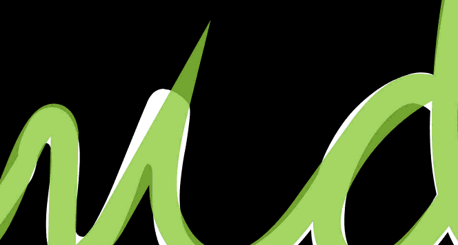
Weird peaks
You’re now going to see something that looks like a mess with strange peaks where the curve was tight or passed over itself. Not to worry, it’s an easy fix.
You can easily fix the oddball peaks with the Live Corners widget. Use the Direct Selection tool and click on one of those problem child points and you’ll see something that looks like a little target. Double-click it to use the widget. This give you a nice small curve you can drag where you need it.
Time to push and drag points
After that, you can start pushing/pulling your points around to line up the path(s). I’m not going to go into adjusting points and Bezier handles as it’s not the focus of this post. There are numerous training resources on the web for that information.
How long will these adjustments take? That depends on your experience in moving points. If you’re an old pro in AI, it may take a matter of minutes. If you’re new to it, it’ll probably feel like you’re trying to wrangle spaghetti noodles in a swimming pool and may take an hour or more.
Fewer is better when it comes to points, but if you need to add one or two to make it work, go for it. My final version is not a perfect match, but it’s close enough for me.
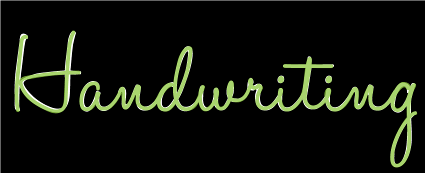
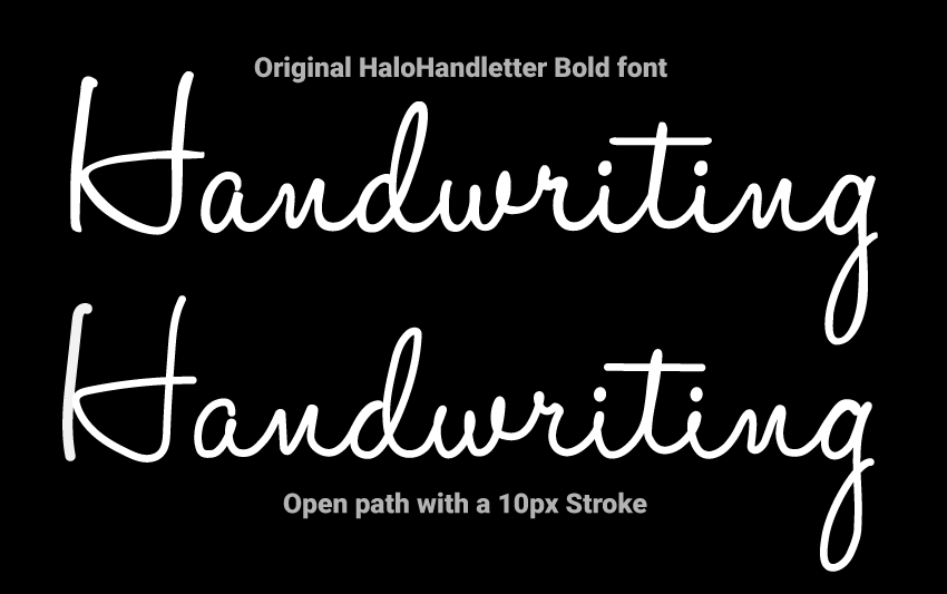
Here’s a side by side comparison of the real font and my new path with a 10pt stroke.
Now the fun part. It’s time to animate. Be sure to name your paths and get your SVG over to your favorite code editor. You can create the animation by getting the path length and animating the offset with plain JavaScript, but I will be using GSAP along with the DrawSVG and MotionPath plugins.
Check out part two of this animated handwriting effect tutorial and keep your pixels movin’.


